Here at EmberTribe, we are continually running different tests and helping our clients find their best approach for their growth marketing. This is not a cut-and-dry approach because every brand and their target audience is different.
When it comes to some of our best-performing ads, you will notice they are all very diverse and customized for the brand they represent.
Here are some key ad creation concepts that are currently working to boost engagement for some of our clients.
Get a look inside how we develop ad angles, experiment with creative, and generate ads that get results with these 9 components of a high-performing ad.
#1 Narrow Your Focus

This ad may not necessarily seem like a show-stopper, but it’s pulling in 80% of this client's email leads. Between the alluring look of the image with the message overlay and the direct call to the customer within the first two lines of the ad copy, people are drawn to stop.
The copy is direct and engaging for the people it’s supposed to be engaging for. The people who aren’t within the target audience will just scroll right by (which means fewer wasted clicks for the client).
You don’t need to target everyone. In fact, you shouldn’t target everyone. Pinpointing a very select audience is the best way to create the kind of ad that is going to speak to the right people.
#2 Test All Parts of the Funnel

Targeting the middle-of-the-funnel crowd worked well for Casa Pilates Equipment. Rather than shoot for those at the very beginning of the buyer’s journey, this ad is jumping right into that mid-point, where the targeted audience has beyond beginner knowledge about yoga and may be looking to add some equipment to their home studio.
Adding the title “My Self-Quarantine Savior!” resonated with the users who were feeling stuck at home. The copy stays focused on the buyer, clarifying how the Casa Pilates team is there to help, how customers are happy with the great service, and how the machines are made to be durable investments.
This ad worked well for remarketing purposes, targeting the crowd that was already somewhat familiar with Casa Pilates Equipment.
#3 Use Value Assets
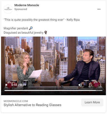
For this ad, the client clearly had an edge—they had their product on Kelly Ripa and we were able to include this 50-second clip of her raving about it. This was paired with a very short, interest-piquing quote from Kelly (“This is quite possibly the greatest thing ever”) and a quick two-liner about the product.
If you have a high-quality asset, like this video, you don’t have to try to add competing text. We let the asset shine on its own and it quickly became a high-performer for this client.
Essentially, you want to get out of the way and let a video like this do all the talking for you.
#4 Showcase Hot Products

This ad is another one that might not seem like much at first glance, but all the elements are working for it.
These are top-sellers on the site and the ad plays blinking text that is just enough to catch someone’s eye as they are scrolling past. It is a great ad for a top-of-the-funnel lead because it showcases these products and offers a simple introduction to the brand.
“The best yard games for any age” is a title that communicates plenty of other game options. The text itself on the image “NEW GAMES, NEW ARRIVALS” is a call to novelty, which is often a great tool for piquing interest and getting the click-thru.
#5 Know Your Audience
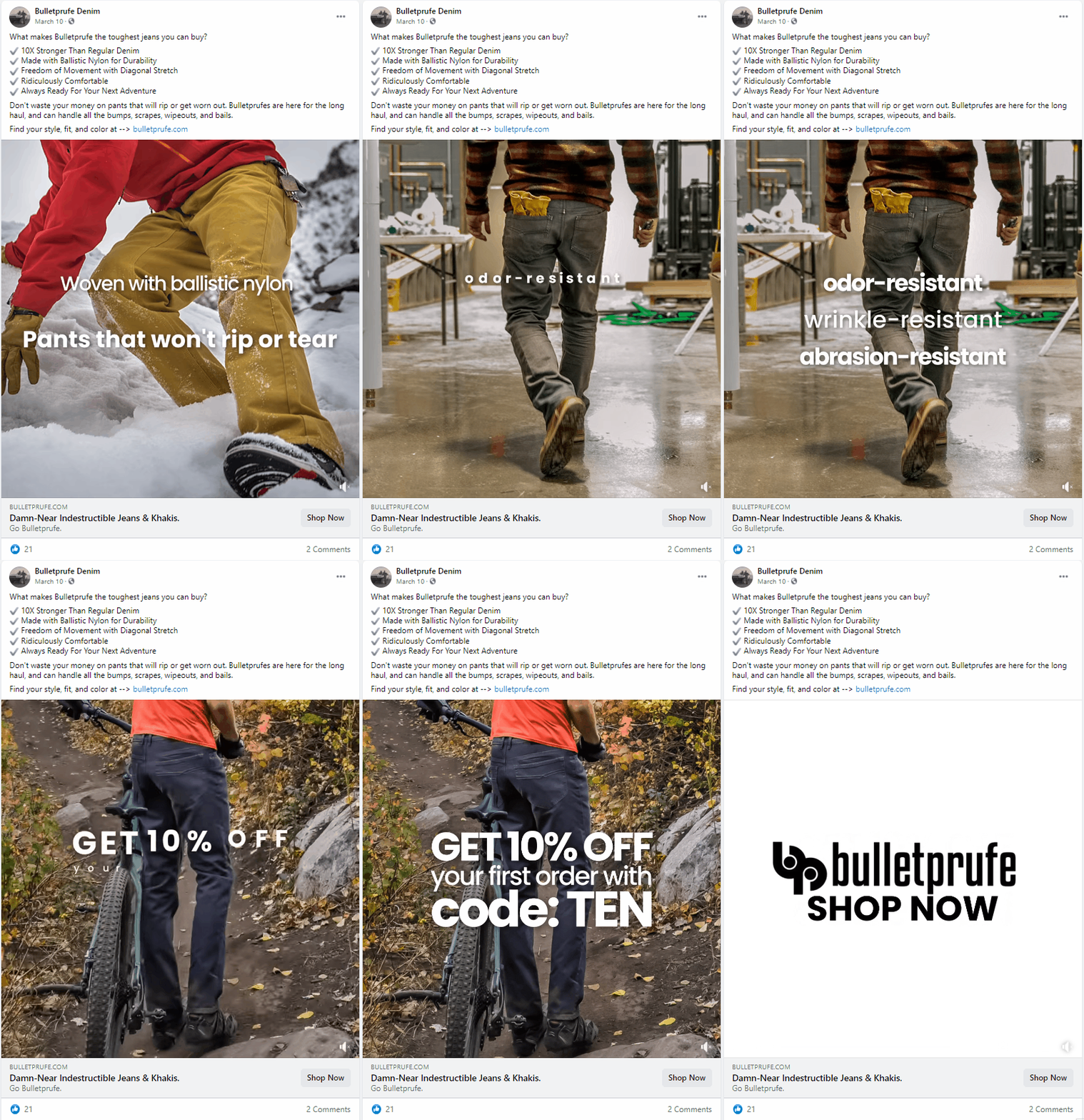
This example is the top-earning ad for this client.
A 10-second smack-in-the-face video of images with text overlay is very attention-grabbing for just about anyone, but really speaks to the Bulletprute audience.
We know that we're targeting a very cut-and-dry audience that is after quality and wants to know what they're getting for the money. Knowing your audience well is a huge asset that is crucial for a successful campaign.
An ad trying to evoke sadness, joy or excitement just wouldn’t go over nearly as well with this audience. This ad feels inspirational and gritty but places a lot of focus on the product's durability and value.
Including the link within the ad text offers a double CTA that often works well.
#6 Understand Customer Pain Points
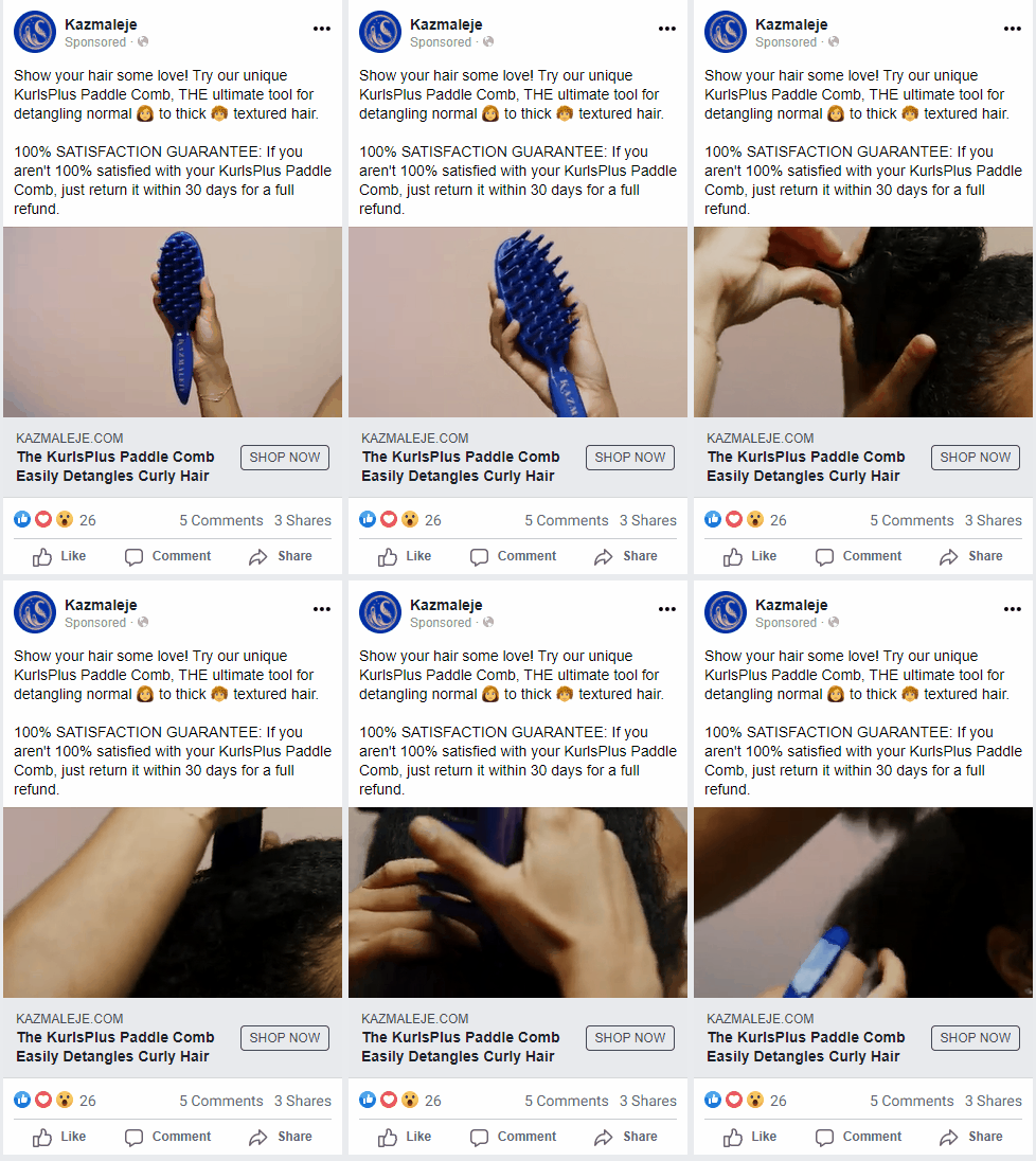
This product is targeting a very specific type of hair (3-4C curls), so the video of it in action offers a lot of impact. Showing the brush gently and easily slide through the thick, healthy hair is a huge selling point.
Anyone with this type of hair is familiar with how much the small bristles can get caught and tangle the hair. The thick nature of the product is a huge selling point and this ad centered in on that value. The ad copy backs this value with the 100% satisfaction guarantee promise.
#7 Tell Your Story
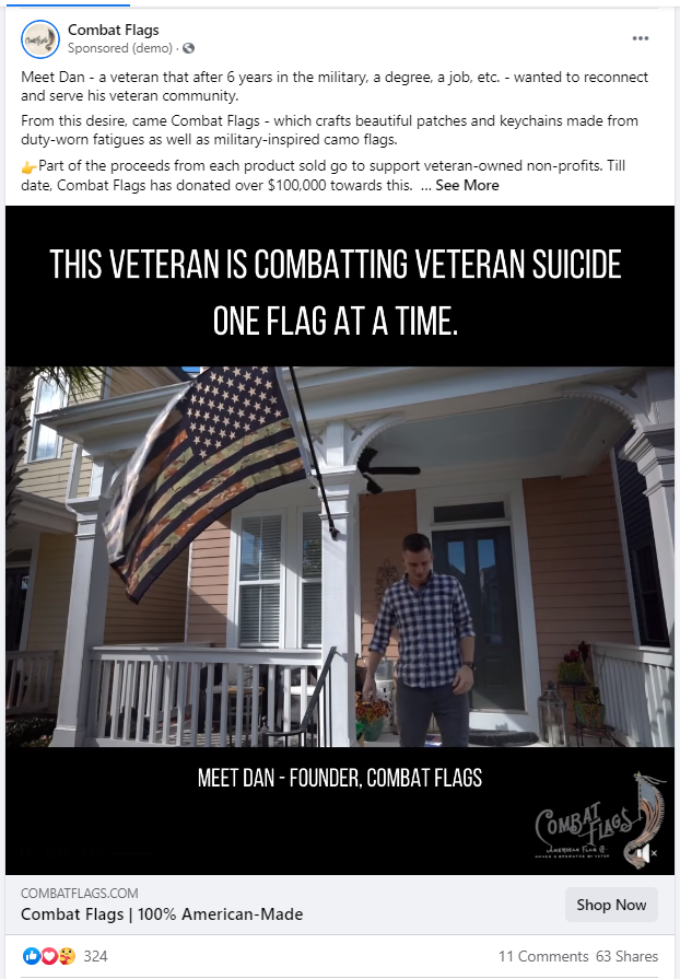
This is a story-telling ad with a powerful video that reveals the story behind Combat Flags. Telling the audience about the company’s “why” often makes a big difference in how customers perceive the value.
There are a lot of people who make similar kinds of patches, but Dan is a veteran who creates patches from retired fatigues. His mission really sets apart his brand.
In the past, he was able to get traffic by just including product images. But, this story-telling ad really took the attention to the next level. People want to know about the companies they are supporting. They will choose a good story over a generic one just about every time.
#8 Aim for Authenticity

This stunning image showcases everything beautiful about beachwear. The women pictured are in a natural element and look like they are just walking through the seagrass near beach dunes. From their hair to their outfits and surroundings—nothing looks contrived or overdone. They look comfortable and happy—which are huge selling points for swimsuits.
The ad copy mentions “luxe” which is then repeated in concept by the title, “Inspired by the lush textures found in a Moroccan market…”
This ad appeals to an unusual product value for this industry and it uses an authentic (but polished) approach that is very appealing to those in its target audience.
#9 Highlight Your Offer

Don’t be afraid to let the focus fall directly on the product. This appealing image is very reminiscent of the flat lays that are popular on Instagram. It lets the coffee speak for itself. And, the audience targeted here is one seeking out simply good brands and love pour-over coffee.
The “FREE Shipping over $25” is an offer that is likely to pique some interest. Many free shipping promises start at $35 (Target) or higher, and $25 doesn’t sound like an unreasonable amount to spend on coffee to someone who will go through a few bags in just as many weeks.
Getting an offer into the ad can sometimes get a click-through. In this case, the product looks good, plus interests leads to check out how many bags they need to buy to get to the free shipping.
The Bottom Line: Make Stand-Out Ads
Are you trying to up your ad game? Our growth marketing agency team could help.
We work with clients spanning all industries to pinpoint their audience and increase their traffic through paid social. We focus on the metrics to find the growth marketing ads that work best for you.
If you're ready to outsource, we can help take the load off.
Talk to us today about how to get better results with your ad spend.


-AK-148968-preview.png?width=842&height=310&name=1.01-1x1px-Embertribe-(Client-Services)-AK-148968-preview.png)





.png?width=810&height=810&name=TJ%20Jones%20-%20%20CoFounder%20EmberTribe%20(1).png)


%20-%20500x500%20-%20SP%20-%2045.01.png)
%20-%20500x500%20-%20SP%20-%2049.01.png)
%20-%20500x500%20-%20SP%20-%2057.01.png)


.png)