Some of our best-performing ads aren't visually impressive, so don't get too hung up on animation or polish, trust the data.
Running "ugly" ads (aka real, lo-fi, less polished) could seem counterintuitive, but if done right, it can help to bring in new customers at a low cost, help convert retargeting audiences, and bring in more traffic to your site.
Consumers trust brands that feel attainable, authentic or aren't big $$$ brands. Ads that are too polished blend in with large companies and often don't attract consumers. Think about the sort of images that you see naturally occurring from other users on your Facebook and Instagram feeds - that is what we’re going for.
If your brand is new, cottage/boutique size, organic, all-natural, "made by moms", etc. then running less-polished" ads could be for you!
Using assets like UGC won't be pixel-perfect but do prove to be very popular and ads consumers trust.
Here are some examples of ads that are producing our best results right now:
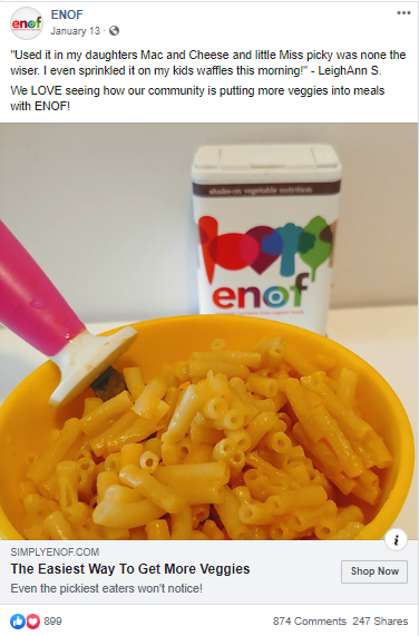
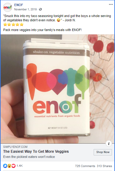
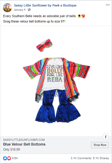
Ideas to test "ugly" ads:
- Encourage your customers to share photos using your products.
- Use Canva to easily add minimal treatments to those simple product photos to make your ad stand out.
- Add a headline or animations
- Add borders, frames, etc.
- Try some fun new fonts
- Instead of putting together a highly produced photo shoot, consider running an influencer campaign to get UGC and third-party social proof.
Less production time helps you be faster to respond to trends, news, events, new stock, inventory issues, sales etc.
Flashy, polished ads don’t always mean great performance. So test out an “ugly” ad and see if it outperforms. You just might surprise yourself!


-AK-148968-preview.png?width=842&height=310&name=1.01-1x1px-Embertribe-(Client-Services)-AK-148968-preview.png)


.png?width=810&height=810&name=TJ%20Jones%20-%20%20CoFounder%20EmberTribe%20(1).png)


%20-%20500x500%20-%20SP%20-%2045.01.png)
%20-%20500x500%20-%20SP%20-%2049.01.png)
%20-%20500x500%20-%20SP%20-%2057.01.png)


.png)